My Work
Identity Collage

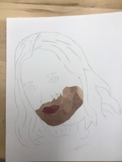
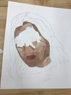
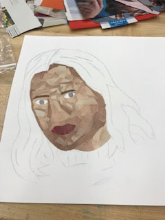
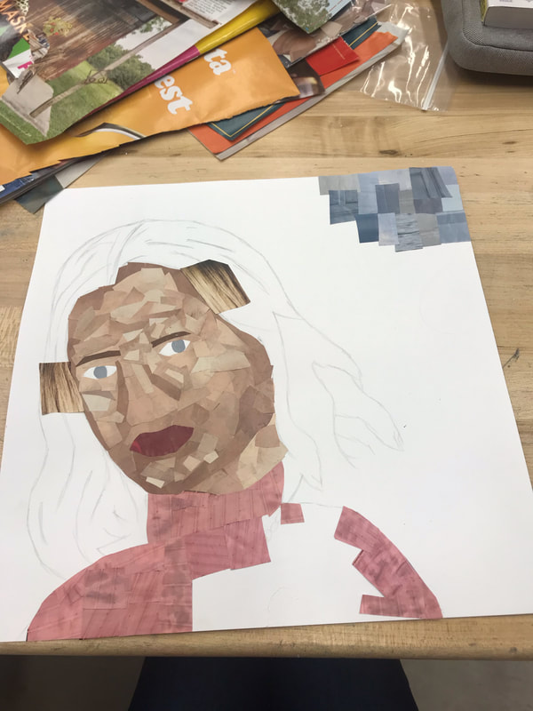
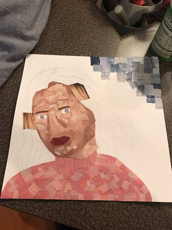
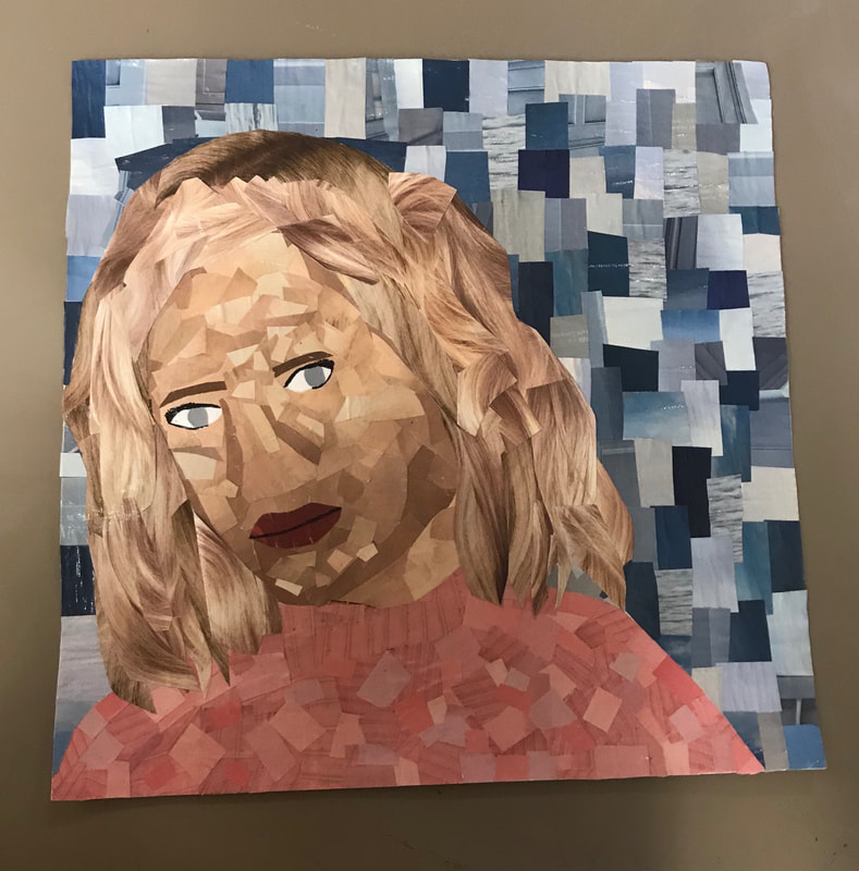
Throughout this project, I learned a lot of different techniques to placing the magazine pieces in different areas. I started out by building my face with different skin tones to accent each other. I learned that by using smaller pieces I could blend the skin tones a little better and give certain areas more definition. I used this method again when making my shirt and background. I picked a few different color tones of each color to help give it more dramatic and appealing look. I wanted to have a more subtle background so my face would be the focal point of the piece. In creating my hair, I angled and placed pieces so that it gives the impression of wavy hair. This project showed me different ways of designing and how using different techniques makes for a better artistic appeal.
I believe you can tell a lot about a person by how they design and create their identity portraits. For example, in my portrait I wanted to give it a clean and precise look. It resembles how I like things to be organized and in its place. The look of my project isn't busy or crowded. I wanted my face to be the focal point, with the background just being a backdrop. Other classmates used words in their background to describe themselves. This is another example on how a person perceives their self and how others see it. People can change things about themselves as well in a self portrait. They can make their facial features the way they wished they looked or can take their freckles out if they chose to do that. In this, self portraits are very different than pictures because it is how you view yourself and your feelings, versus what you actually look like. It can give a false image but reflects on how you see yourself and how you want to be seen as well.
I believe you can tell a lot about a person by how they design and create their identity portraits. For example, in my portrait I wanted to give it a clean and precise look. It resembles how I like things to be organized and in its place. The look of my project isn't busy or crowded. I wanted my face to be the focal point, with the background just being a backdrop. Other classmates used words in their background to describe themselves. This is another example on how a person perceives their self and how others see it. People can change things about themselves as well in a self portrait. They can make their facial features the way they wished they looked or can take their freckles out if they chose to do that. In this, self portraits are very different than pictures because it is how you view yourself and your feelings, versus what you actually look like. It can give a false image but reflects on how you see yourself and how you want to be seen as well.
Progress Pictures:
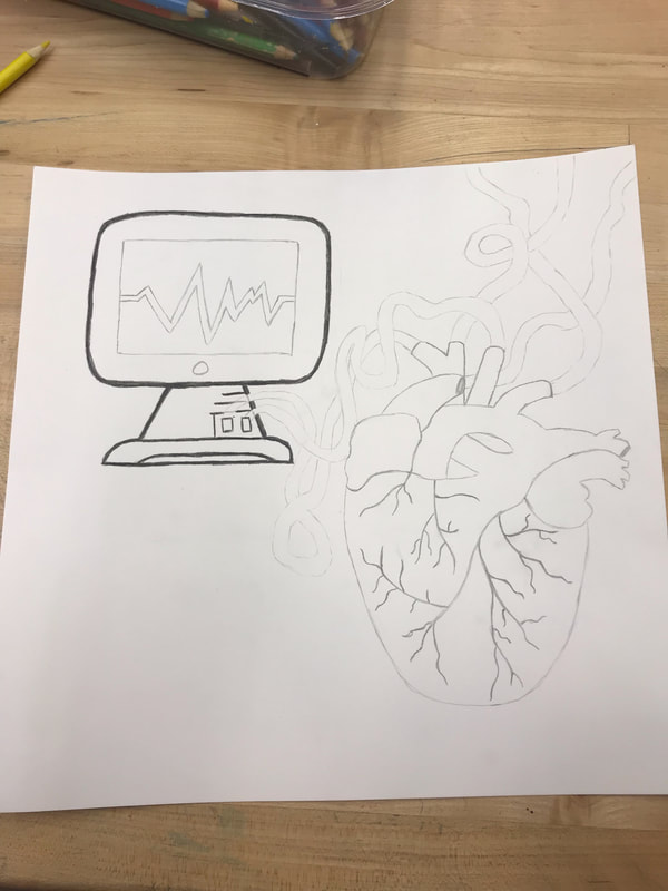
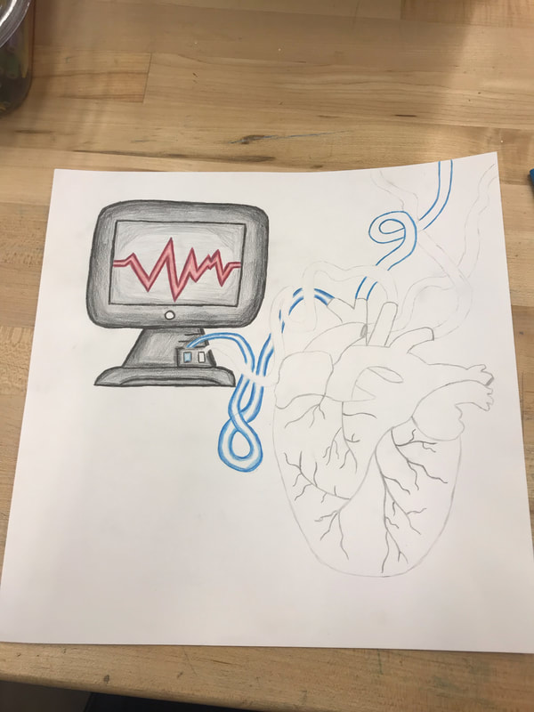
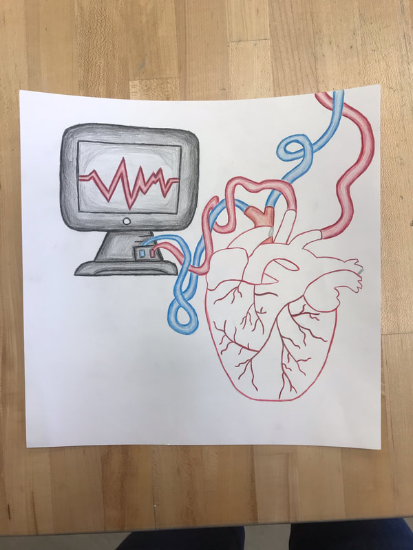
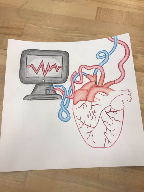
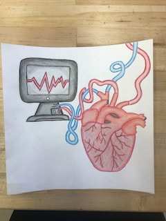
The Real Anatomy of Technology

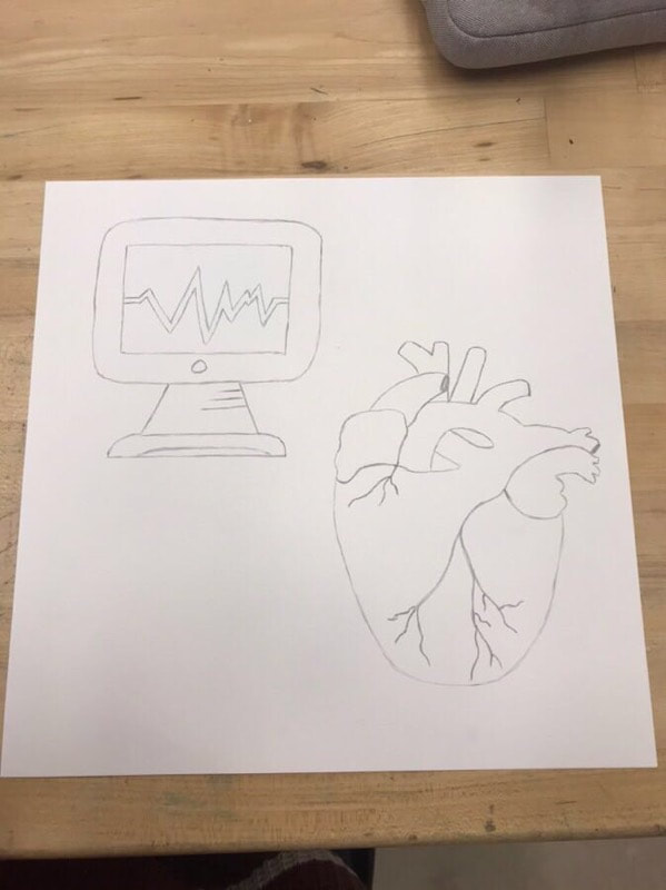
I really enjoyed doing this project. I learned a lot of new techniques. Not only drawing abstract objects, but how to shade and bring the artwork to life. I first sketched out the piece; balancing the two objects diagonally. I made the veins be the cord of the heart monitor, tying the two objects together. The heart monitor symbolizes how the heart is connected towards one's last days of life. It helps doctors determine if the heart is still actively working properly. The other two veins were to convey how the heart means so much more than just it's purpose of keeping the body alive, thus going elsewhere. In my shading, I wanted the top part of the heart to be a little lighter than the base to convey the reality of how the heart isn't all one color. In the top part I used oranges, reds, and browns. When moving to the bottom half, I merged my colors and adding dark blue and shaded my reds a little darker than before. I also added random lines to show how the heart is rough and it gives it a more visual appeal of the veins.
Technology impacts our society in so many ways. My family and I rely on technology for a number of things. Right now, I use technology, such as a laptop, for my online classes. Without a computer, I would not be able to have the opportunity of taking college classes online, thus gaining credits towards my future. My family also relies on technology; not just for entertainment, but in their jobs and careers. My dad, who is a farmer, uses GPS, auto steer technology, data integration, and other uses that impact his job greatly. These sources of technology help him monitor his crop production and growth, thus helping him harvest these crops. Other types of technology my family relies on daily is cell phones and TVs. My mom is a realtor who needs to have her phone on her at all times as the main source of communication with her clients. As for TV, we watch the news and sporting events as our main source of entertainment, as well as learning what is going on in the world. The types of technology I will rely on and use in my future is screening technology, like x-rays, MRI, heart monitors, etc. because I’m going into the medical field. A lot of these sources of technology help diagnose illnesses, thus being able to treat patients. Without these gadgets, I would not be able to help people and attempt to cure their illnesses. Not only does technology impact these careers, but so many more. Technology has advanced greatly in the last few decades. When talking with my dad, he stated how he had to look up information for homework in an encyclopedia. He also said that the computer came out about the time he was a senior, allowing him and other students to write papers without fear of making mistakes, like a typewriter would. Nowadays, students look up information and research their ideas on the internet to get what they were looking for. A lot has changed in the technology world, and it will only continue to advance and increase its demand.
This project made me realize how much we rely on technology and how important it is in a number of careers. The human body is constantly connected to technology in some sort of way. Making a piece of artwork that reflected this was very meaningful to me in the fact that it represents everyday life.
Progress Pictures:
Value of Words

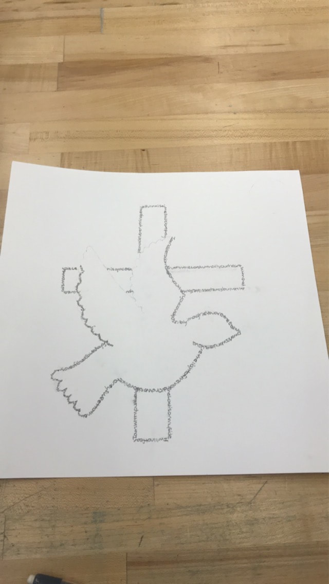
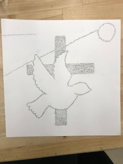
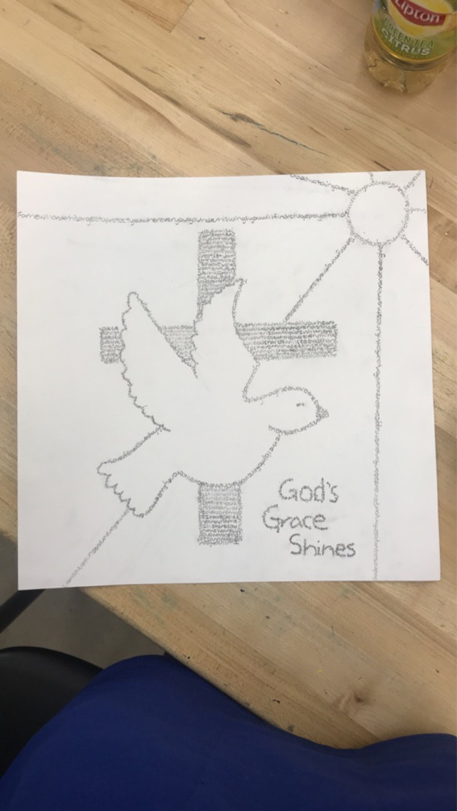
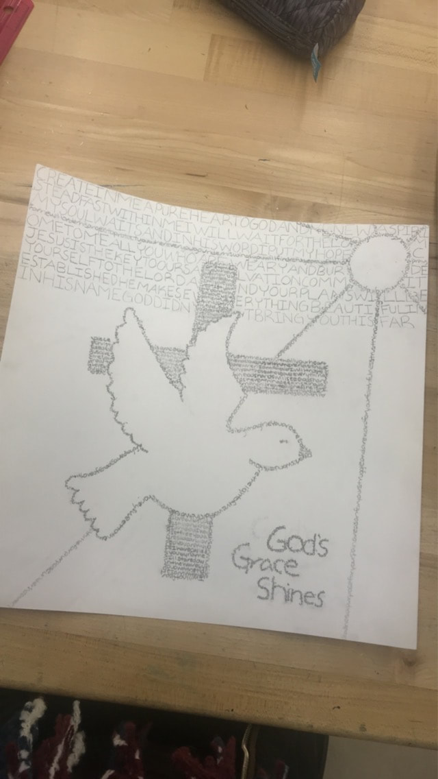
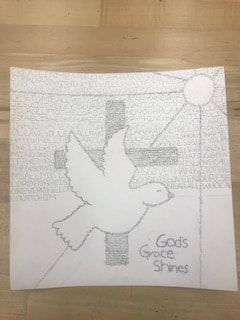
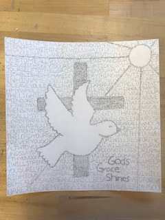
I really enjoyed this project because I could make the object come to life. In my project, I wanted to convey a very serious topic in my life. I have never expressed myself and my beliefs through art in this way before. In brainstorming my subject, I first wanted to implement the sign of the cross. This was my base of the image as it gives viewers the subject matter and explains what the piece is about. As the cross moves outwards, the darker I made my words to make it more visually appealing. After that, I thought about other symbols that Christ represents, thus a dove came to mind. A dove constitutes love and peace through the Holy Spirit. Due to this, I wanted to convey how Jesus is the spotlight and should be the center of our lives, hence I made the dove all white with a darker contrast in the background. In creating the image, I found it hard to decide my font size. It was difficult to define the ridges of the wings with a bigger font, so I then made that part smaller to really give it dimension. Moving on to my background, I created a sun with rays that cast down on the earth. I chose this concept because Christ’s light shines upon us and provided us with day and night. Due to this, I made the rays go from dark to light as it moves across the paper. I also added, “God’s Grace Shines.” This symbolizes that he uplifts our hearts and renews our spirit each day. Throughout the rest of the piece, I applied larger words to contrast the smaller ones used in my subject matter. I really struggled in this part of the piece because I am one to have everything be perfect and orderly. In this, I wanted to expand my artistic ability and just go for it. Hence, in creating this section, I varied my font sizes to exude how Jesus forgives our mistakes. Like I said, it drove me crazy how I made some words bigger and more spaced out than others, but I really wanted to give the background more meaning than it could have been. The words I used throughout the piece are various verses in the Bible to really emphasize the piece and give it meaning. Some people overlap their words and build them up, but since my words really impacted the image, I chose the words to be in an orderly fashion. This provides the viewer to be able to read them.
I don’t believe all works of art need to have descriptions because the viewer can interrupt the image in the way they see fit. For example, there could be an image of a barn with a cloudy sky. Many people might describe this piece as a storm is arising, others may think about crickets chirping and the sound of peace. Pieces that include words often give the project meaning and a sense of clarity. It tells a story to the viewer, making it easier for them to interpret and understand the piece.
I don’t believe all works of art need to have descriptions because the viewer can interrupt the image in the way they see fit. For example, there could be an image of a barn with a cloudy sky. Many people might describe this piece as a storm is arising, others may think about crickets chirping and the sound of peace. Pieces that include words often give the project meaning and a sense of clarity. It tells a story to the viewer, making it easier for them to interpret and understand the piece.
Progress Pictures:
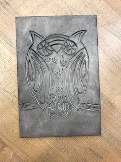
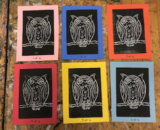
Printmaking

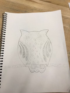
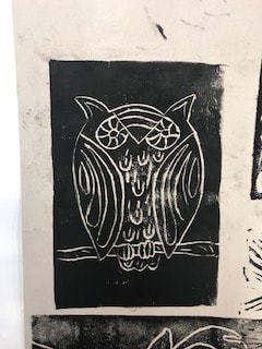
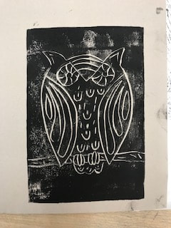
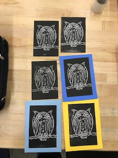
When I heard about this project, I wanted to do something a little bit different. I typically like to make my projects very serious and realistic. But in this project, I wanted to change it up and have some fun with it. I chose to print an owl. You can see that the design isn't like that of a real owl. I chose random designs to represent a fictional character. This made the project very fun and intriguing for me. I first sketched it out on paper and then drew it on my lino cut. Surprisingly, I found this part very difficult and frustrating because when I would make a mistake, it was hard to erase and would smear. It was hard to make details of the wing reflect each other. I tried several times with this part and eventually got it to resemble one another. I then started cutting the piece out. I really enjoyed this section of the project. After cutting it out, I then did a few test prints. I realized that I wasn't applying enough pressure in certain areas, in which this became kind of frustrating. I also saw that I had to cut out more pieces or deepen my cuts in some sections. Following a few more test prints, I moved on to my final prints. Some pieces have areas that are not as dark and defined as others, but I thought it really gave the print more character. It gave it a dusty look and it turned out cool. I left them to dry for the night so they wouldn't smudge. The next day, I cut out my prints and laid them on different colors of paper. I wanted to give them color to really brighten and define the piece. This part was a little stressful because I had to measure the borders and cut them to be exactly the same. When taping the prints onto the paper, my print would angle itself. This was hard to correct because the paper would start to rip, so I had to leave it. Another mistake I had made was writing my editions. I was more worried about messing up the numbers and hadn't realized that I was writing them in the middle. Editions are supposed to be in the corner and I was unable to fix it because of my use of sharpie. However, this was a fun learning experience using different mediums and exploring new ideas of art.
Progress Pictures:
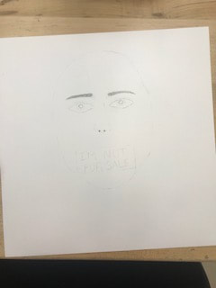
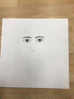
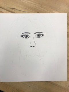
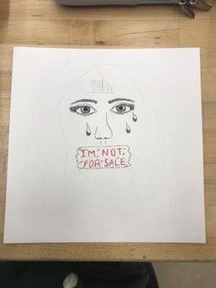
Art for Awareness
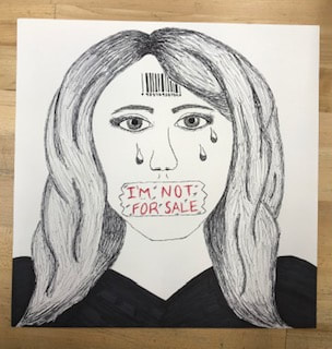
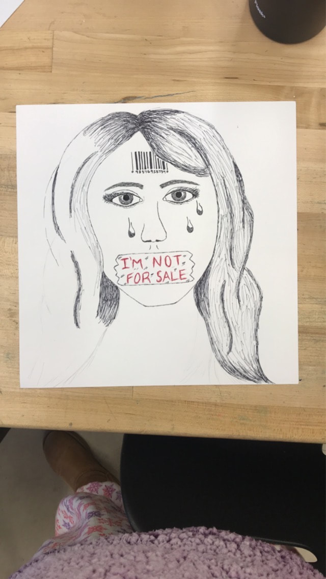
Throughout brainstorming topics, I really wanted to demonstrate how powerful and heartbreaking sex trafficking is. The rates of sex trafficking are constantly increasing, especially in Minnesota. I wanted to raise awareness to this serious issue as it is becoming a greater problem in my area.
To convey the challenges of sex trafficking, I chose to represent a young, beautiful girl who's been broken down by the horrible tragedies she has been faced with. I decided to draw my piece in black sharpie to resemble how dark and unfathomable the subject is. To add attention to the topic, I wrote the words, “I am not for sale.” I put these words in red, in a sketch-like technique, to portray the blood and life threatening situations sex trafficking entails. It demonstrates a cry for help, as I had included tears of desperation. This adds tremendous emotion to the piece as it embarks the greater feelings of sex traffickees. Not only that, but I also incorporated a bar code that gives a clear definition to what the piece is about. I feel as though this is a very important and influential detail to the piece. It describes how humans are sold for sexual entities. Bar codes are typically used to label a person. This is when they become an “item” and not a person.
Throughout my process of the piece, I encountered various challenges. My first challenge was sketching out her eyebrows. I had a hard time making them line up and resemble each other. I found that in starting small, I could keep building and adding more to them to match one another. My next setback was drawing her eyelashes. I practiced several times before I put them on my final piece. In the end, they met my expectations and looked good.
Furthermore, this project was one of my favorites. I liked how each of us could express ourselves and our emotions to a certain social issue. We had complete choice in our subject matter, as well as the media used to portray our thoughts. Due to this, I liked how everyone’s project differed from one another, expressing different ideas and emotions.